Archive
Archive for the ‘Charts’ Category
Radar Chart visualizing Cost of Living in select US Cities
2016/11/06
Leave a comment

Source:Sperling’s
Categories: Charts, e-commerce, Media
charting, MS-Excel
Line chart of GINI coefficients for select economies since 1980
2015/04/02
Leave a comment

Based on this Dataset from the World Bank, a bit more recent than the Wikipedia Chart currently.

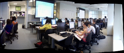
Summary of the LRC main classroom use in year 2012/3
2013/06/22
Leave a comment

(Tentative while experimenting with Calendaranalytics).
Summary of my work calendar in year 2012/13
2013/06/22
Leave a comment

(Tentative while experimenting with Calendaranalytics).
Categories: Analytics, Charts, Metrics, reports, Visualizations
calendaring, ms-calendaranalytics
2012/3 enrolment per language in the main LRC constituent departments (LCS and ELTI)
2013/01/24
Leave a comment

LRC Workshop Demand Survey Results
2012/04/24
Leave a comment

7 responded, 1 commented. OP=Oral Proficiency.
Categories: audience-is-teachers, Charts, e-infrastructure, e-languages, e-learning, Media, Polls, Visualizations, workshops
audacity, calendaring, kaltura, moodle, saba-centra
Collaborative timeline activity for face-to-face classes on history
2006/03/15
Leave a comment
- An easily produced and repeated classroom activity, originally developed for listening comprehension and speaking practice in language classes, based on filling out collaboratively a timeline spreadsheet in the digital audio lab:
- Listen and process/write:
- Advanced German class listens to segments of an authentic German cultural history documentary from the authentic German TV series “100 deutsche Jahre” (which follows a single topic throughout 20th century German history).
- And each student enters notable summaries of events with their time of occurrence into a spreadsheet
- that the teacher
- has at beginning of activity distributed to each individual student using the digital audio labs file management features
- and after listening collects from students, merges, either with student author data or an anonymous student identifier (for corrections), into an excel timeline spreadsheet
- and visualizes the collaborative outcome as an easily collated timeline on the projector to the entire class.
- Speaking: Discuss!
- Identify what are the gravity points for the comprehension of the video by the class: Why are these events deemed important?
- What are the outliers? Criticism? Justification?
- Also correct language errors in the student output.

- In early 2006, there was no Excel web app – collaboration likely has become simpler now
- launch link to publically editable spreadsheet to class
- visualize using excel web app charts
- In early 2006, there was no Excel web app – collaboration likely has become simpler now
- Listen and process/write:

Categories: Charts, classroom-activities, digital-humanities, German, learning-materials, Listening, Speaking
charting, excel-web-app, MS-Excel, timelines

Questions? Read the About. Or just ask me a quick Our Databases: Resources with calendars -- Language learning material Moodle Sites, multimedia files -- films


FAQs for LRC student staff or for students or for teachers. To search our FAQs, in the browser addressbar, add after "https://plagwitz.wordpress.com/feed/?tag=faqs+/" "+TAG1" (from tag cloud below) OR "https://plagwitz.wordpress.com/feed/tag=faqs
&category_name=" "CAT1" (from category hierarchy below). OR search both categories and tags, and multiple TAGs/CATs (connect with "," for OR-search, with "+" for AND-search), like so: https://plagwitz.wordpress.com/feed/?tag=TAG1+TAG2+...TAGn&category_name=CAT1
+CAT2+...CATn"
Other ways to find help
If you cannot find it here, look there: 5,500 Language-Learning Links and Programs for learning or teaching 150 languages
Shortcuts:Our Lists, Our Maps, LRC Staff Moodle Site,LRC Project Moodle Site, 49erexpress, UNCC Moodle, Student Recordings: s:claslcslrcsanakostudent
Learning usage samples: Sanako oral exam, Kaltura webcam presentation, Dictation with speech recognition, Sanako written exam, Chinese and Japanese interactive stroke-order practice
Test the Sanako Installer, Webbrowser Popup Konfigurator for XP, or Windows7, faster LRC TeacherPC Log-in Let MS facilitate diacritics writing by installing for you US-International keyboard layout
This is my personal blog (Google+). The views expressed on these pages are mine alone and not those of my employer. The information in this weblog is provided “AS IS” with no warranties, and confers no rights.
