Archive
Archive for the ‘Visualizations’ Category
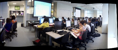
LRC classroom usage 2013/4
2014/06/23
Leave a comment
Mapping of Language Student Locations using PowerView
2014/03/09
Leave a comment
- What do our language students call home? Based on a pivot-table that counts zip codes, let PowerView tell you, which is can now distributed as a free add-in for Excel 2013 Prof, but you need to enable it (under File / Options / Add-Ins).

- Comes with a nifty zoom:


- Click, then Hover a data bubble for more info;

- Like with Bing Maps Visualization, the weighting is surprising:

Mapping of Language Student Locations using Bing Maps
2014/03/09
Leave a comment
- What do our language students call home? Based on a pivot-table that counts zip codes, let Bing Maps tell you, a default add-in easily accessible in the insert section of the ribbon:

- Note a Limitation: Bing Maps max 100 data points.

- So we limited to zip codes with at least 15 students (which returns just below 100 zip codes).
- Also note, the Bing maps app cannot be increased beyond a certain size (below is the maximum).

- Finally, note that the visualization does have a weight indicator, but it seems imperfect:


- Here is how data (type) input errors get handled (duplicates override the original):

- Fix your data, the reload from the upper right unfoldable menu:


- Voilà:

Summary of the LRC main classroom use in year 2012/3
2013/06/22
Leave a comment
(Tentative while experimenting with Calendaranalytics).
Summary of my work calendar in year 2012/13
2013/06/22
Leave a comment
(Tentative while experimenting with Calendaranalytics).
Categories: Analytics, Charts, Metrics, reports, Visualizations
calendaring, ms-calendaranalytics
First results with MS-Calendar Analytics for learning center management
2013/06/22
Leave a comment
- You can use the controls on the right to drill into the detail by selecting one or more
- Aliases,
- Attendees,
- Time periods
- Status.
- The graphs on the left and in the center will automatically reflect your selection on the right.
- These results lead to more questions. E.g. why is this tripod so popular?

-
Lesson learnt: Now it comes back to haunt us that we block broken or MIA equipment from users attempting to book it by making it look “busy” with an 24/7 “Appointment“. However, It should however be possible to filter out such appointments, versus “meeting requests”.
LRC Workshop Demand Survey Results
2012/04/24
Leave a comment
Categories: audience-is-teachers, Charts, e-infrastructure, e-languages, e-learning, Media, Polls, Visualizations, workshops
audacity, calendaring, kaltura, moodle, saba-centra


